According to calculations from Current Population Survey microdata released today, the union membership rate in 2023 was 10.0 percent, down from 10.1 percent in 2022. The union coverage rate, which includes non-members covered by contracts, was 11.2 percent in 2023, unchanged from 2022.
In 2023, 14.4 million workers were union members, an increase of 135,000 from 2022, and 16.2 million workers were covered by union contracts, an increase of 190,000 from the previous year. In 2023, the US added 2.7 million non-union jobs.
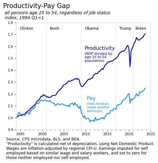
Some tools for thinking about the economy worked less well during the pandemic. One such instance involves the productivity-pay gap. A famous chart from Larry Mishel at the Economic Policy Institute shows worker productivity and worker pay diverge after the implementation of neoconservative economic policies during the early 1980s. Updating this chart or its variations with recent data shows a strange bump in both productivity and pay, during the pandemic. These misleading bumps come from “composition” changes in the data and have already been the source of some confusion.
The issue is that the businesses that were closed during the pandemic (for example for public health reasons) were disproportionately less-productive and lower-paying than the ones that stayed open. And since only people who are working and only businesses that are open get counted in measures of productivity and pay, both measures increase sharply during the pandemic.
Of course, we know that our society did not become more productive or higher paid when millions of people were laid off; collectively we became less productive and lower paid. There were major supply shortages and unprecedented needs for government support. The data gives the opposite picture because the sample used to calculate the result was reduced and the composition of the people in the sample changed. The bumps come from excluding a large number of people from the measure during the pandemic.
So how do we get around the composition issues? One technique is to keep the full sample over time. For example, if someone loses their job, rather than remove them from the sample used to measure wages, keep them in the sample and count their wage as zero. Likewise, rather than measure productivity per hour of work, measure it per person, whether the person is working or not.
That’s what I’ve done with the above chart, which shows productivity and pay for the 25 to 54 year old population. The age 25 to 54 group is sometimes called the “prime age group” in labor economics as they are employed at the highest rate. The pay line shows median inflation-adjusted usual weekly earnings, regardless of job status. The productivity line divides net domestic product (GDP excluding depreciation expenses) by the age 25 to 54 population.
These techniques aren’t perfect1, but they are useful for showing what took place during the pandemic without the composition effects. The actual story during the pandemic was the layoffs; society was producing and earning less. Most economists seem to compare current data to 2019 to exclude pandemic effects, but this approach won’t work in some cases, such as when isolating the different presidential terms. In this case, a measure that makes 2020 look very good instead of very bad has the effect of creating a false baseline for the Biden presidency. The irony here is that Biden has reversed the anti-union rhetoric of the previous presidents and is actually addressing the productivity-pay gap.
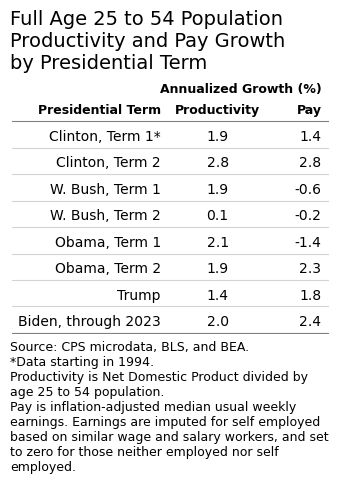
To show this effect, here’s the annual growth rates from the chart above, grouped by presidential term. If we take out the labor composition effect, Biden’s results look pretty good. Productivity and real wages are both growing at an above-average rate and the gap between the two is closing.
For example, my productivity measure is not particularly meaningful on its own. In development economics its relatively common to consider GDP per capita as a measure of productivity, but in the US we typically measure productivity as GDP per hour of work, which causes the aforementioned labor composition issues. So using NDP per 25 to 54 year old is a compromise to avoid composition issues, to avoid issues from changing age demographics, and to be consistent with the age 25 to 54 pay measure. ↩︎
The phrase “investing in America” may be associated with children, infrastructure, or alternatives to pollution. I tend to think about this as changes in the built environment. In other words, what are we letting rot and what are we building?1
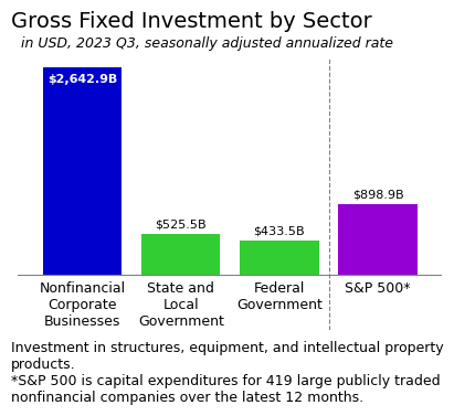
My sense is that many people overestimate the direct role of the public sector in actual investment in the modern US. Of the current $5.8 trillion per year of tangible investment in the US, under a trillion comes from the public sector. Nonfinancial2 corporate businesses invest nearly three times as much as the government (see chart). This is how the US economy is structured; administrative capacity—our ability to do things—is in the private sector. More often, the assumed role of the public sector in the modern US is to encourage investment.
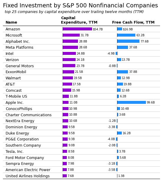
So what investment is actually happening? To get an overall sense of this, we can see which companies are investing the most. In the nonfinancial corporate business sector, a sizable portion of investment is done by publicly-traded companies. Among the 430 large publicly-traded nonfinancial companies in the S&P 500, I could find capital expenditure data for 419. Capital spending at these firms represents about a third of US nonfinancial corporate business investment3.
The top 25 publicly-traded nonfinancial companies by capital spending are included in the table below. Amazon tops the list, with $54.7 billion in capital spending, representing investments in warehouses, data centers, and trucks; Amazon’s HQ2 was completed in 2023. The large tech companies invest in research and development, including AI technologies, but have also been building out domestic production capacity. Automakers have been retooling to produce electric cars. A large number of companies on the list are tied to the boom in oil and gas production.
Whatever your thoughts may be on this list or the types of investment and the national direction it represents, it’s worth pointing out that money is left on the table by running investments in the future through the private sector. Even after making these investments, companies have lots of cash leftover (free cash flow column). This money gets returned to shareholders in an environment where the portion of available income in the economy that goes to workers is already falling.
Ultimately, we really don’t have much of a say about what gets built, under this system. Shareholders can vote for directors but most shares are owned by a small percent of the population and investors don’t often take an active role. Further, the lion’s share of business investment is done by privately-held companies, anyway.
Specifically gross investment, which is total capital spending and includes both spending to maintain the existing built environment and spending to grow the built environment. ↩︎
For accounting purposes researchers often exclude financial companies like banks. The concept of capital spending is somewhat less clear for the financial sector. ↩︎
These measures are not exactly comparable. For example, the national accounts data covers domestic investment, including foreign direct investment, and the S&P 500 is the investment of US companies, including abroad. Instead, the measures provide context for each other in terms of scale. ↩︎
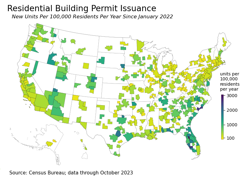
Housing affordability is a major issue in the US, and has spread into smaller metro areas. While demand for housing has sent prices well above their pre-pandemic levels in most areas, supply has been disproportionately added in the southern region. Of the 1.6 million people added to the US from July 2022 to July 2023, 1.4 million were in the south.
As one result of these changes, California and states in the northeast region will continue to lose congressional seats and states in the south will add them. In response to estimates of changing congressional apportionment, some have pointed out that the south is disproportionately building the new housing, so it only follows that the south will have the population growth. The causality is perhaps unclear, but this seems like a reasonable interpretation.
Each month the Census Bureau reports building permits issued in major metro areas. Using these reports, I’ve divided new housing units permitted in each metro area each year by the existing resident population. The goal is to identify the areas that are likely to build a lot of new housing relative to the current population. The results are mapped below.
I should point out that not all building permits that are issued result in housing being constructed, but the map gives a decent idea of where growth is likely to be highest over the coming year.
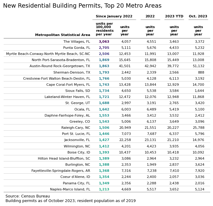
The top 25 metro areas by units issued per resident per year are shown in the following table. The highest rate of issuance for residential building permits is in the smaller- and mid-sized metro areas of central and southwest Florida. Among large metro areas, the fastest growth is in Austin, Texas. The Myrtle Beach area on the North Carolina and South Carolina border is also primed for growth.
Population growth returned to pre-pandemic trends in 2023, according to Census estimates released Monday. The US added 1.6 million people over the year ending July 1, 2023, a population growth rate of 0.5 percent. During the year prior to the pandemic, the US added 1.5 million people.
There are two components to population growth: net migration and natural increases. Net migration is calculated as immigrants moving to the US minus emigrants moving from the US. Natural increases are calculated as births minus deaths. The rebound since the pandemic has been led by increased immigration. In 2019, there were 570,000 net migrants to the US, compared to 1.14 million in 2023.
The US added 500,000 people through natural increases in 2023, about half the pre-COVID rate. There were 3.6 million births and 3.1 million deaths during the year. Since 2021, the number of births in the US has increased by 70,000 per year and the number of deaths has fallen by 285,000 per year.
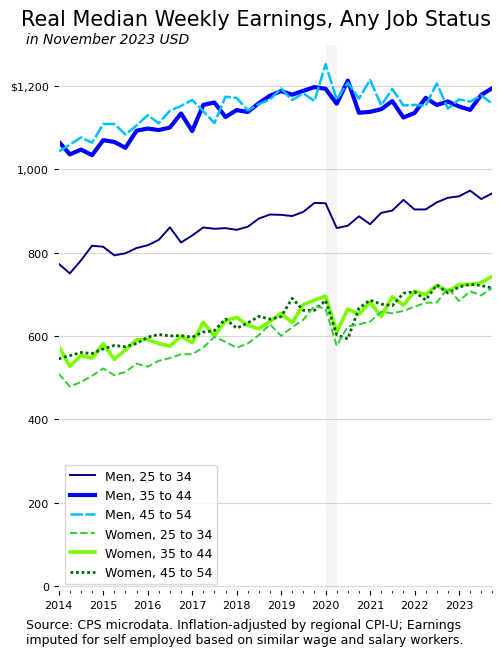
There’s been renewed discussion about real wages and the associated measurement issues. The main issue concerning these data in 2020 and 2021 is caused by compositional shifts in the work force. Lower income workers were more likely to lose their jobs during the pandemic. When this happens, these workers are removed from the sample of people used to calculate the median wage, causing the median wage to increase.
There are already many very good pieces discussing real wage measurement issues. Two worth highlighting are “Real Wages” and Aggregation: A Methodological Mess from Alex Williams, and Are Real Wages Rising? from Joseph Politano. These are great primers on real wages and various measurement tools and issues.
Rather than comment further on these issues, I’ve put together a chart that addresses some of these concerns, based on a very clever concept from Ryan Radia.
The basic idea is to calculate the median across everyone, whether they have a job or not. If they do not have a job, their wage is zero. This resolves the compositional issues and reduces issues that crop up from using a matched-observation wage growth measure like the Atlanta Fed Wage Growth Tracker.
Lots of interesting results show up. There’s the gap between men and women, which is large and persistent. Men’s weekly earnings increase with age, but women’s don’t. Also, women’s weekly earnings fell during the pandemic suggesting women were working fewer hours due to care burdens. And, since the pandemic, women and younger men have seen higher rates of wage growth than older men, which is in line with findings of a compression of the US wage distribution.
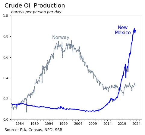
While the US invests in climate-related initiatives and alternatives to fossil fuels, domestic oil production is also at an all time high. The oil and gas boom in the Permian basin has resulted in a large financial windfall for New Mexico. The state is investing its oil and gas royalties in diversified assets and using the returns on those assets to fund expansions and improvements in childcare and education. It will be interesting to follow the results over the next few decades.
The Boom
By the number of barrels produced, the current oil boom in New Mexico, adjusted for population, is larger than the oil boom that propelled Norway’s national wealth. In September 2023, New Mexico produced 1.8 million barrels of oil per day, equivalent to 0.86 barrels per person per day. At the height of oil production in Norway in 2001, the equivalent rate was 0.76 barrels per person per day (see chart).
It looks like 2023 will be a record year for oil production in New Mexico, or very close to it. In some ways, the stars aligned for New Mexico’s oil and gas industry. The Permian basin has been very productive, oil prices were high, and geopolitical developments put pressure on the US to produce more oil.
In a matter of a few years, crude oil production quadrupled in New Mexico and the state became the second largest producer in the US. The largest producer, Texas, has 30 million residents compared to 2.1 million in New Mexico. New Mexico has fewer residents than Queens.
While the boom in oil production is a relatively new development, New Mexico has been one of the poorest states in the US for many decades. And, there’s no guarantee in the US that nearby residents benefit from increased mineral extraction. Air and noise pollution and spills all increase. Crucially, however, among the poorest states in the US, New Mexico is the only one where the Democratic party is able to enact laws1. The combination of the oil boom with these factors presents a fascinating set of possibilities for the future.
Investing in Kids, Reducing Poverty, and Hopefully Mitigating Environmental Impacts
When New Mexico became a state in 1912, the Land Grant Permanent Fund was created to invest the revenue generated by mineral extraction. The fund has grown to become one of the largest government investment funds in the country, and the state has since created additional investment funds.
Essentially, similar to Alaska and Norway, New Mexico invests its oil and gas royalties in diversified global assets like stocks, bonds, and real estate. These investments generate returns which are distributed to the state each year, to fund government services. Traditionally, the distributions have been used to supplement school funding in the state. Now that the amounts are fairly large, the state has been building out a comprehensive child care system that looks very promising.
In November 2022, voters approved a constitutional amendment making New Mexico the first state to guarantee the right to child care, paving the path to a universal childcare system. This will not be not an easy lift and will mean building out a child care workforce through subsidies, education grants, and wage standards, and building a system to connect parents to providers. I imagine other states are watching closely.
Of course, the growth of oil and gas production also presents serious environmental and public health issues for residents. There are more spills and more air and noise pollution, which lead to illnesses and contaminated land. Rapidly increased production of oil has meant a lot more venting of natural gas, as well. Further, the boom will eventually end. Eventually the wells will run low enough so that further extraction becomes expensive and production slows. Once the boom is over, the state and its people will be left with the mess.
As I understand, there have been fewer victories in regulating the oil and gas industry. State regulatory departments are understaffed and rely on the Federal government and self-reporting by the industry in many cases. In an ideal world, the state or federal government would own most of the companies involved, but absent that, increased oversight is important.
For New Mexico and the US as a whole, there’s a need to balance domestic energy production and the revenue and opportunities it brings with the costs of this production which can be long-term and geographically concentrated. Success overall will depend on reining in the worst environmental practices and making good investments.
Republicans take full control of Louisiana starting in 2024, and hold supermajorities in both chambers of the Kentucky General Assembly. ↩︎
The vibes debate popped back up last week. I wrote about this in September and in more depth earlier this month. Part of the recent discussion was on “real wages” and whether people are better off. This is precisely the aspect of the debate that bugs me, so I’ve come up with a chart to try to show a bigger picture view of recent economic events.
When I think about smart, good-faith people doing important research in economics, Arin Dube is at the top of the list. Professor Dube’s recent work shows inflation-adjusted wage growth among low wage workers and a compression of the US wage distribution. When sharing these findings, however, Professor Dube has received negative responses from the general public. In a sad twist of irony, it seems that the more Professor Dube is precise and accurate, the more confused and angry the responses.
There’s no reason to doubt Professor Dube’s results or methods, but it’s not clear how to interpret the negative sentiment towards his findings, or the negative sentiment reported in polls, more generally. Either this sentiment needs to be dismissed entirely or the cognitive dissonance it creates needs to be resolved in another way. To me, resolution comes from not conflating real wage growth with individuals being better off. I avoid treating the two as interchangeable because wages are only part of income and spending patterns vary massively between households. A household can experience real wage growth and still be financially worse off at year’s end.
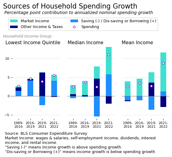
To show this point, I’ve put together a chart that summarizes the volatile economy over the past few years. Rather than isolate a key variable, such as wages, from confounding factors, such as prices, demographics, and composition effects, I’ve gone the opposite direction. I present a stylized overview and ignore the Consumer Price Index completely.
The chart shows household spending growth alongside the components that make up this growth: changes in market income, changes in all other income and taxes (on a net basis), and changes in saving. Households spend some additional amount each year, represented by the circle, and cover this spending with either new income or by borrowing or drawing down past savings. If a household’s income growth exceeds its spending growth, the leftover income becomes savings. These categories of income, spending, and saving are shown for the bottom 20 percent (quintile) of households by income (left chart), the median household (middle chart), and the average (mean) household (right chart). More background is included below.
The goal of the chart is to show the broader context for real wage growth. Specifically, I want to capture the following three missing determinants in whether someone is better off:
Market income is not typically the source of spending growth for low income households;
The pandemic-related boost in other income helped households across the distribution in 2021, but the disappearance of that income combined with higher spending led to significant dis-saving for the typical household in 2022; and
The nominal spending increase for the typical family in 2022 was very large.
In other words, many people are not helped directly by real wage growth and the recent period is explicitly characterized by wages playing a smaller overall role. We can simultaneously appreciate real wage growth and realize that it doesn’t solve many problems.
To be fair, however, I should point out that much of the cumulative increase in real wages since 2019 has happened during 2023, and this is not captured in my chart, nor is the corresponding drop in inflation in 2023. My chart is admittedly a very “vibes” response to the scrupulous work of a serious researcher.
All of that said, putting real wage growth into a broader context does reveal merit in the argument that people are upset over losing non-wage income. Certainly people have been through a lot and the economy could be better; there’s no shortage of ideas for improvements. And, of course, the economy could also be a lot worse or the vibes can simply change. To some extent, it’s a question of whether consumer sentiment can remain sour longer than the economy can stay hot.
Optional Background
There are a few accounting identities in economics that are empirically true and foundational but that feel a bit funny. One of those identities represents the relationship between income y, consumption or spending c, and saving s, as follows:
y = c + s
In macroeconomics, this function (with capitalized letters) represents the idea that all income in the economy is either spent (consumed) or saved. In microeconomics, the same function represents the household budget constraint. Households receive income and face choices about what to do with it.
The reason the formulation feels off, to me, is that income is far more volatile than spending. At a national level, people and firms save more during expansions and draw down their savings during recessions. At the household level, people experience a rollercoaster of income throughout their lives, yet always consume at least some basic amount.
In fact, ideally, as individuals, we convert volatile income payments into smooth consumption patterns, across our lifespan and from week to week. Stable consumption in a world of choppy income is a basic financial goal for nearly everyone. To represent this goal, we can rearrange the function as follows:
c = y – s
The idea here is that we have some ideal level of consumption, c, and we meet it by either 1) having exactly enough income (y = c, s = 0), 2) having more than enough income and saving the balance (y > c, s > 0), or 3) not having enough income and dis-saving or borrowing the balance (y < c, s < 0).
Perhaps this is trivial, but the simple rearrangement of these variables gives interesting results when applied to the macroeconomic national accounts data or to microeconomic data on consumer expenditures. The results from the national accounts are captured in the US Chartbook section called Sources of Consumer Spending Growth. The consumer expenditures data is used in the chart above.
Data Notes
The data used in the chart above comes from the Consumer Expenditure Surveys of the Bureau of Labor Statistics. Spending, in my chart, is consumer expenditures minus spending on pensions (which is a form of saving). Market income includes wages and salaries, as well as capital income and self-employment income. Other income and taxes is the net effect of income taxes and welfare programs and other forms of non-market income.
Saving, in this context, is a negation, i.e. increased saving means a reduction in spending. When the saving / dis-saving component in the chart is positive, it means household saving was negative and the household covered spending growth through dis-saving or borrowing. When the saving / dis-saving component is negative, it means the household had money left over after covering the increase in spending.
US average hours worked were stagnant before COVID-19 but fell in the last two years for ostensibly positive reasons. The US would need large-scale labor market reform to achieve major increases in leisure time, but the current economic conditions present an opportunity to negotiate flexibility.
Background: Measuring Hours Worked
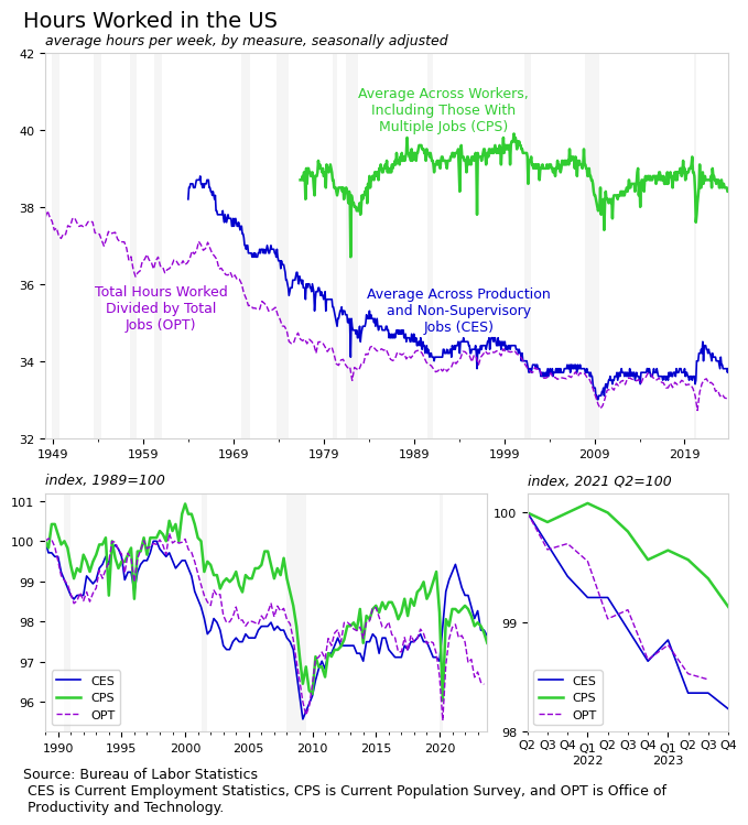
The question of “how many hours are people working?” requires a little bit of background to answer. Different measures give different results, with sometimes diverging trends.
If you ask businesses about their payroll hours, you’ll get an answer that is far lower than if you ask people how many hours they work (see chart below). Researchers can explain this gap in mechanical ways. For example, a person with one 40 hour per week job and a second 10 hour per week job averages 50 hours per week in the household survey (CPS) and 25 hours per week in the payroll survey (CES). But rather than focusing on the gap between measures, let’s look at the trends in hours worked, across measures, which are isolated in the two smaller charts.
The average hours worked per job fell gradually after World War II and again during the 1960s and 1970s, but the pace has slowed considerably since the 1980s. Since 1989, hours worked have fallen between 2 and 4 percent in total, depending on the measure. Much of the pattern in hours worked, particularly since the 1980s, is cyclical; people work less during recessions and more during expansions.
One notable exception to the cyclical nature of hours worked is found in the establishment survey during the COVID-19 pandemic. The production and non-supervisory workers who maintained their jobs during the pandemic saw hours worked at these jobs increase substantially, even while other workers and the population as a whole was working less. The increase in hours worked was partially the result of a change in the composition of who is being measured.
Importantly, since mid 2021, the trends all point to a relatively sharp drop in hours worked. This decrease is particularly interesting given the current strong GDP and employment figures; the US is in an expansion so average hours would usually be rising rather than falling. In the last couple years, hours worked have fallen by one to two percent, representing as much as half of the overall change since 1989.
Hours Worked by Sector
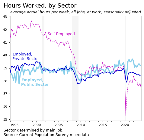
Of the measures discussed in the previous section, the household survey (CPS) shows the smallest reduction in hours worked since 2021. This should be expected, as the number of multiple jobholders increased, driving up the CPS measure and driving down the other measures. Using the CPS, let’s look at hours worked among self-employed people and among those employed in the public and private sectors (see next chart).
Trends in hours worked diverge by sector. The public sector worked fewer hours per week than the other groups, during the 1990s, but now works more than other groups. To the extent that we expect the public sector to lead the charge in reducing average workweeks, it has not been the case. Since 1994, hours worked have fallen in the private sector and risen in the public sector. The increase in hours may stem from restrictions on hiring in the sector.
Additionally, the hours reported by self-employed people have fallen from over 42 hours per week to 37 in the latest data. This group is not counted in most measures of hours worked and their work hours do not get factored into most wage or productivity measures, but they represent a sizable portion of the workforce.
The length of the workweek in the US seems relatively stuck since the 1980s. This begs the question about why we continue to work so much, even as technological advancements should allow us more leisure time. The divergence in trends by sector gives a clue about what may be going on. Self-employed workers are uniquely positioned to negotiate flexibility in work hours and to obtain leisure time, and it seems that they are doing so. In contrast, most employees in the US are tied to an inflexible system.
Why Do We Work So Much?
Economist John Maynard Keynes once envisioned a 15 hour workweek by 2030 due to rising productivity. However, with 2030 nearing, this shortened workweek is far from standard.
So why has the length of the workweek largely stalled in the US? Dean Baker and Jared Bernstein summarize the issue well in their bookGetting Back to Full Employment,
The stagnation in the length of the workweek/work year has led some people to view the 40-hour workweek and skimpy vacation time as somehow natural. It is not – this just happened to be the point where we largely stopped our reduction in work hours. It makes as much sense to view the current workweek or work year as natural as it does to view a particular median hourly wage as natural
In other words, the workweek’s stagnation reflects a halt in reducing work hours rather than any natural equilibrium. So why did we stop?
Evidence From Abroad: The Case of Sweden
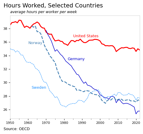
International comparisons provide the most obvious evidence that the workweek has no “natural” level and is instead determined by negotiated labor market reforms. While the reduction in hours worked in the US stalled, other high income countries now work far fewer hours without sacrificing quality of life, health, or happiness.
Moreover, these changes did not just appear; other countries intentionally reduced their work hours through labor market reforms. Sweden offers an early example, followed by Norway. Germany is also a well-known case. Hours worked fell 30 percent below the US level in each of the these countries.
In the case of Sweden, the Social Democratic Party (SAP) was in government from the 1930s through the 1970s, and achieved major labor market reforms during this period. As examples, in 1938 Sweden implemented a 4-week national vacation system, and in the 1970s, Sweden lowered its retirement age, created a part-time work option for those age 60 to 65, introduced parental leave and training study leave, and added a fifth week of vacation leave. By 1980, workers in Sweden had nearly 10 additional hours of leisure time per week compared to Americans.
The Swedish model is sometimes described as “negotiated flexibility.” Rather than trying to control or dictate hours worked, the goal is to give people more options to allow them to better handle the challenges of their own lives. Workers and employers have negotiated a system that gives people more choices between work, family, studying, or leisure. As one example, the labor market in Sweden is more likely to offer a reversible part-time option so that people can study or handle temporary changes in their family without risk of losing their job. This flexibility is extremely popular among workers.
A flexible system that keeps workers and employers connected during changes in workers lives has benefits for employers, as well. When demand increases, employers can typically increase production without having to find and train new workers. So if an alternative system benefits workers and employers, why don’t we have it in the US?
Why Can’t the US Negotiate Flexibility?
In contrast to the US, the employer-worker relationship in Nordic countries and Germany is sometimes characterized as collaborative. These groups have far more opportunities to work together to solve common problems under the collective bargaining and union system that is strong in Nordic countries and Germany but weak in the US. Many businesses in the US have no system for co-determination. Likewise, workers in the US may be less likely to trust firms in cases that involve a reduction in work hours, for example.
Further, one of the strongest arguments for why the US has not achieved a reduction in work hours is that our health insurance system is tied to work. Unlike countries with national health insurance systems, US employers shoulder the fixed cost of health insurance for workers and their families. The high fixed cost associated with workers is one reason firms in the US historically prefer to reduce headcounts in response to lower demand, rather than to reduce work hours. In essence, our lack of a national health insurance system ties us to a longer workweek. The private health insurance system limits our ability to choose nonstandard work arrangements.
One of the goals behind the health insurance exchanges in the ACA was to allow people the option to buy their own health insurance and become self-employed. The exchanges allow people more options, though private health insurance can be expensive. As seen in the sector chart above, self-employed workers have reduced their work hours far more than other groups since the 2010s.
While the US faces hard limitations due to our healthcare system and collective bargaining system, we can perhaps achieve additional flexibility, along the margins. To assist in this process, it may be useful to distinguish between 1) changes in standard workweek, and 2) “non-economic” changes in the share of people who work the standard amount, for example through holidays, vacation, or other leave. Let’s see how the US is doing on both of these fronts.
Standard Workweek
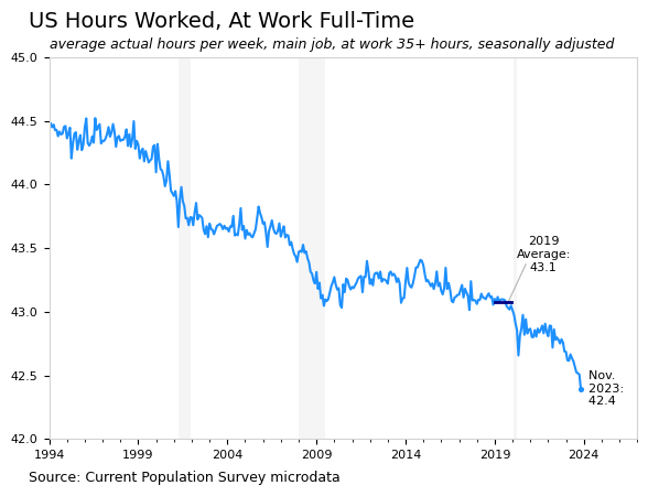
In the US, the standard workweek has been 40 hours since the Fair Labor Standards Act was passed in 1938. The typical workweek of course varies by employer, and researchers in the US generally count a workweek of 35 hours or more as “full time”. In 2023, an average of around 120 million people work full time, meaning 35 hours or more, during a given week.
Among the group of people who work full time during the CPS reference week working hours have steadily declined. This trend seems to have accelerated in recent data. In 2019, people at work full time averaged 43.1 hours of work at their main job; in the latest data, the average is 42.4 hours, a reduction of nearly two percent (see chart below).
The average hours worked in a full week are falling sharply in recent data, though it’s less clear why. A decrease of 0.7 hours per week for 120 million people is a far cry from the Swedish model, but does matter; it translates to roughly two million fewer unemployed people.
The timing of the recent decrease is perhaps more interesting than the amount of the decrease. Previous decreases coincide with weak labor markets, while the current drop coincides with a strong labor market. There has been some discussion about whether individuals are using the strong labor market to bargain for preferred policies, like telework or flexible schedules, rather than higher wages.
Non-Economic Work Absences
A trope in cartoons and TV shows a “gone fishing” sign on a storefront to represent people enjoying leisure instead of working. One of the biggest differences between American workers and workers in other wealthy nations is that American workers have much less time for fishing.
The US is sometimes called the “no vacation nation” because it stands alone among developed countries in refusing to guarantee paid vacation for its workers. At the federal level in the US, workers don’t get much more than basic legal protections for any type of leave, let alone a system of income replacement.
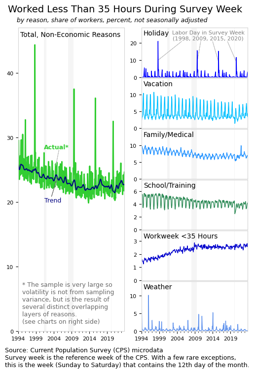
And while the US has 11 federal holidays per year, workers are not guaranteed time off or extra pay in the US. President Biden added Juneteenth to the list of federal holidays, which will slightly reduce hours worked, but not everyone will get to enjoy it. Many people work on holidays, and the trend in this regard is going in the wrong direction. The overall trend for “non-economic”1 work absences, and the trend for several individual categories, are shown in the following chart.
While the standard workweek seems to be falling gradually, the trend around non-economic work absences shows the opposite–fewer workers are taking time off from work. This unfortunate and surprising result suggests that a long period with a weak labor market meant lost progress on several fronts. In practice, no vacation nation has gotten worse.
Though barely visible in the chart above, there are signs that the worrisome trend started to reverse slightly in recent data. Vacations have certainly been rising over the past few years, though some of that is a rebound from the pandemic. More to this point, access to sick leave and family leave has improved. Additionally, the share of jobs with a workweek of less than 35 hours is increasing again, slightly, after a decade of stagnation. Finally, some of the trend in the above chart reflects an aging workforce that needs less time off for school or childcare.
Despite some bright spots, at an aggregate level, there has been little progress in giving people flexibility in their work schedules in the US. Indeed, the US seemed to be moving in the wrong direction on this front. More recently, a tight labor market seems to have stopped the trend of fewer people taking time off. Ultimately, it is critical to realize that these are not the types of changes that will be invented by a startup in California. Meaningful increases in the share of workers with alternatives to the full-time workweek would require large-scale negotiations that involve the government and the private sector and that result in major legislation.
Translating Productivity to Flexibility
People value leisure time and also value having flexibility in their work schedules. International comparisons show that reductions in work hours are popular and sustainable, however, structural issues in the US, such as private health insurance and low union membership, generally complicate efforts to reform labor markets. As a result, workers in the US are guaranteed no paid leave and most are tied to the standard workweek.
Current challenges aside, the US is in a relatively strong economic position for making reforms. Strong economic growth, higher productivity growth, the potential of technologies like AI, and a tight labor market all create conditions through which productivity can be translated into negotiated flexibility.
Union negotiations between businesses and workers in the auto sector and entertainment industries have been fruitful and should filter through to other industries. Part of these negotiations, as well as the negotiations in the railroad industry, involves work flexibility and paid leave. Historically, these types of labor confrontations can spur broader changes.
The post-pandemic environment also features a large increase in teleworking. While this shouldn’t affect payroll hours for employees, it does affect their actual time dedicated to work, as it reduces commute time. This is a benefit for workers and a boost in leisure time. Increased telework should equate to increased productivity as fewer inputs are required per hour of work. This effect may be reflected in the reported work hours of self-employed people, which have fallen recently, as seen in the sector chart above.
Ultimately, the US should try to achieve key labor market reforms like paid leave policies, additional holidays, mandated higher pay for holiday work, improvements in benefits systems, and breaking the relationship between work and health insurance. If not immediately possible at the federal level, progressive states can try to tackle some of these issues. Likewise, there is more room for negotiation between unions and businesses and plenty of room for more unionization.
The labor market will not be tight forever and state governments can only do so much. The federal government will play a role in any major change in leisure time in the US. There was nothing natural about the decrease in work hours in Sweden or Germany, for example; concerted national action was essential to that process. These reforms are popular and the Democratic party should try to seize the economic moment in the US.
The term non-economic essentially means voluntary, and serves to distinguish voluntary absences like vacations or even sick days from “economic” absences like slack business conditions or being unable to find full-time work. The share of workers working part time for economic reasons is currently very low. ↩︎
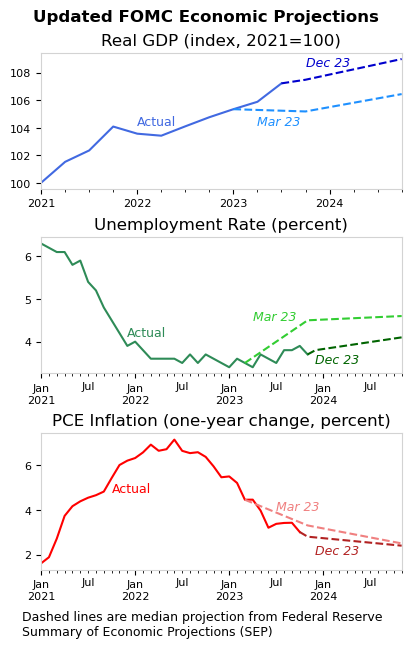
The peoplewho determine monetary policy in the US report their forecasts for key economic indicators. The group’s December forecast was released yesterday and shows an improved outlook.
At least eight times a year, the Federal Reserve board members and regional bank presidents who are members of the Federal Open Market Committee (FOMC) meet for two days in Washington, D.C. to discuss and vote on monetary policy. In conjunction with these meetings, members report their forecast for the outlook of the US economy. Specifically, members report projections for GDP, unemployment, and inflation. Each quarter, the Fed releases a summary of these projections, in what has become a closely watched report.
The actual data, March 2023 projections, and December 2023 projections are summarized in the following charts. In each case, the actual data is significantly improved over the March 2023 projection. Real GDP is higher than previously forecast, and unemployment and inflation rates are lower.
Reflecting improved economic conditions, the December projections, released yesterday, show a far more positive outlook than was expected in March. In March, one-year GDP growth for 2023 was projected to be a meager 0.4 percent; the December projection shows growth of 2.6 percent. Likewise, the unemployment rate was forecast to rise to 4.5 percent in 2023 Q4, but has not, and is now projected to average 3.8 percent in Q4. Further, PCE inflation is below the March forecast of 3.3 percent and is now expected grow by 2.8 percent this year.
While the FOMC left monetary policy unchanged in the December meeting, the projection materials show lower interest rates in 2024. In essence, improvements to the actual economy have taken pressure off of the Fed. Pending any major disruption, the FOMC can now pivot their focus from stopping inflation toward finding and maintaining neutral monetary policy.