Real Wage Measures

There’s been renewed discussion about real wages and the associated measurement issues. The main issue concerning these data in 2020 and 2021 is caused by compositional shifts in the work force. Lower income workers were more likely to lose their jobs during the pandemic. When this happens, these workers are removed from the sample of people used to calculate the median wage, causing the median wage to increase.

There are already many very good pieces discussing real wage measurement issues. Two worth highlighting are “Real Wages” and Aggregation: A Methodological Mess from Alex Williams, and Are Real Wages Rising? from Joseph Politano. These are great primers on real wages and various measurement tools and issues.

Rather than comment further on these issues, I’ve put together a chart that addresses some of these concerns, based on a very clever concept from Ryan Radia.

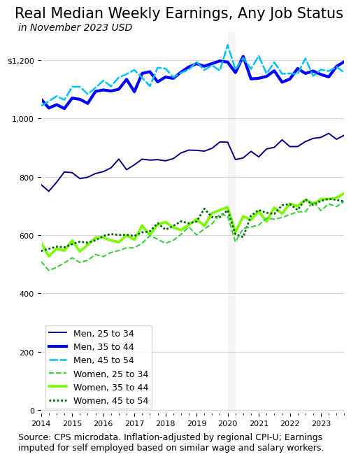
The basic idea is to calculate the median across everyone, whether they have a job or not. If they do not have a job, their wage is zero. This resolves the compositional issues and reduces issues that crop up from using a matched-observation wage growth measure like the Atlanta Fed Wage Growth Tracker.

Lots of interesting results show up. There’s the gap between men and women, which is large and persistent. Men’s weekly earnings increase with age, but women’s don’t. Also, women’s weekly earnings fell during the pandemic suggesting women were working fewer hours due to care burdens. And, since the pandemic, women and younger men have seen higher rates of wage growth than older men, which is in line with findings of a compression of the US wage distribution.

Real Wages, Inflation, and Consumer Sentiment

Wages are increasing faster than inflation. Additionally, wage growth rates are strongest for low-wage workers. Despite real wage growth, surveys show weak consumer sentiment, particularly among low-income households. A simple but perhaps overlooked factor when thinking about this disconnect is income inequality1.

When the US entered the first period of higher inflation in 30 years, I struggled with thinking about how higher inflation would affect different groups of people. Who are the winners and losers? I’m still parsing the data on this question, but one aspect that struck me is that a commonly-used measure for answering the question is sometimes misinterpreted. Specifically, real wage growth (the wage growth rate minus the inflation rate) is not sufficient for gauging who keeps up with inflation.

To be clear, real wage growth rates are important and useful, and higher rates of real wage growth for low-wage workers are absolutely worth applauding. But the obvious issue, as I see it, is that people compare their income to their individual spending, not to the inflation rate. To see this, let’s compare two households under two inflation scenarios. 

Household A represents the bottom fifth of US households by income, with income of $12,200 per year and spending of $28,700 per year. Household A ends the year with dis-saving or borrowing of $16,7002. In contrast, household B represents the top fifth of US households, with income of $175,000 per year and spending of $121,500 per year. Household B ends the year with savings of $53,500. 

Under a scenario meant to represent a typical year, both households’ income increases by three percent, and prices increase two percent (one percent real income growth). If neither household changes their spending habits, the end-of-year financial picture for household A worsens by $200 (income increases by $370 and prices increase by $570) and the financial picture for household B improves by $2,800 (income increases by $5,200 and prices increase by $2,400). 

To point out the flaw in relying solely on real income or real wages, let’s look at a high-inflation scenario. In this scenario, income increases by nine percent for each household and prices increase eight percent. The same one percent real income growth, in the high-inflation scenario, results in an end-of-year financial picture that is $1,200 worse for the low-income household A ($1,100 increase in income and $2,300 increase in prices) and $6,000 better for the high-income household B ($15,700 increase in income and $9,700 increase in prices). 

Higher inflation supercharges the already-wide gap in financial outcomes between low- and high-income households. Positive real wages, ironically, do not keep up with inflation for low-wage households, because of extreme income inequality.  To really drive this point home, under the current three percent inflation rate, the low-income household A would need annual real income growth of 17 percent to keep up with the high-income household B receiving no real income growth.

  1. Income inequality won’t explain why high-income households report dissatisfaction. Others have pointed to high interest rates as a possible explanation for weak overall consumer sentiment. I’m instead pointing out that positive real wage growth does not beat inflation for many people. In terms of why inflation might explain dissatisfaction among higher-income groups, you could, I suppose, argue that people compare their income to the consumption basket of their dreams. In this situation, every household is a bit like low-income household A in the scenarios I discuss. ↩︎
  2. These household income and spending figures are from the 2019 Consumer Expenditure Survey. While it may seem like the low-income household is spending too much, relative to their income, these data are consistent with the consumption function and the idea of autonomous consumption. People have to spend some money just to survive, whether their income supports it or whether they borrow and dis-save. Beyond autonomous consumption, people spend some share of their income and save the rest. In this example, the high income household spends four times as much as the low income household. ↩︎