Sources of Household Spending

The vibes debate popped back up last week. I wrote about this in September and in more depth earlier this month. Part of the recent discussion was on “real wages” and whether people are better off. This is precisely the aspect of the debate that bugs me, so I’ve come up with a chart to try to show a bigger picture view of recent economic events.

When I think about smart, good-faith people doing important research in economics, Arin Dube is at the top of the list. Professor Dube’s recent work shows inflation-adjusted wage growth among low wage workers and a compression of the US wage distribution. When sharing these findings, however, Professor Dube has received negative responses from the general public. In a sad twist of irony, it seems that the more Professor Dube is precise and accurate, the more confused and angry the responses.

There’s no reason to doubt Professor Dube’s results or methods, but it’s not clear how to interpret the negative sentiment towards his findings, or the negative sentiment reported in polls, more generally. Either this sentiment needs to be dismissed entirely or the cognitive dissonance it creates needs to be resolved in another way. To me, resolution comes from not conflating real wage growth with individuals being better off. I avoid treating the two as interchangeable because wages are only part of income and spending patterns vary massively between households. A household can experience real wage growth and still be financially worse off at year’s end.

To show this point, I’ve put together a chart that summarizes the volatile economy over the past few years. Rather than isolate a key variable, such as wages, from confounding factors, such as prices, demographics, and composition effects, I’ve gone the opposite direction. I present a stylized overview and ignore the Consumer Price Index completely. 

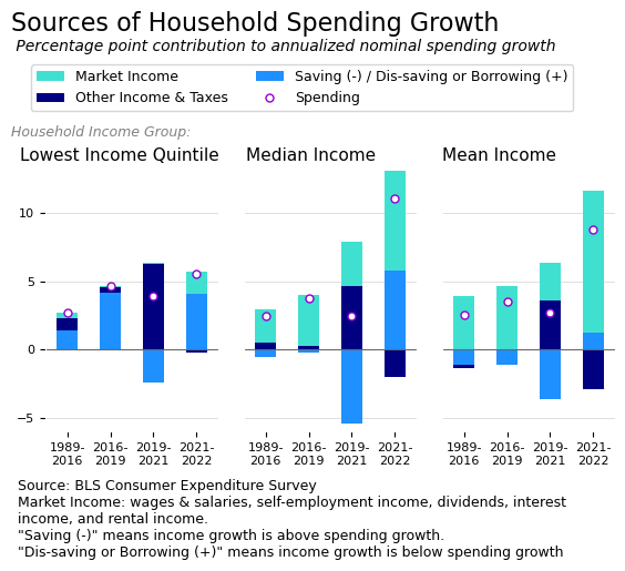
The chart shows household spending growth alongside the components that make up this growth: changes in market income, changes in all other income and taxes (on a net basis), and changes in saving. Households spend some additional amount each year, represented by the circle, and cover this spending with either new income or by borrowing or drawing down past savings. If a household’s income growth exceeds its spending growth, the leftover income becomes savings. These categories of income, spending, and saving are shown for the bottom 20 percent (quintile) of households by income (left chart), the median household (middle chart), and the average (mean) household (right chart). More background is included below. 

The goal of the chart is to show the broader context for real wage growth. Specifically, I want to capture the following three missing determinants in whether someone is better off:

  1. Market income is not typically the source of spending growth for low income households; 
  2. The pandemic-related boost in other income helped households across the distribution in 2021, but the disappearance of that income combined with higher spending led to significant dis-saving for the typical household in 2022; and 
  3. The nominal spending increase for the typical family in 2022 was very large. 

In other words, many people are not helped directly by real wage growth and the recent period is explicitly characterized by wages playing a smaller overall role. We can simultaneously appreciate real wage growth and realize that it doesn’t solve many problems.

To be fair, however, I should point out that much of the cumulative increase in real wages since 2019 has happened during 2023, and this is not captured in my chart, nor is the corresponding drop in inflation in 2023. My chart is admittedly a very “vibes” response to the scrupulous work of a serious researcher. 

All of that said, putting real wage growth into a broader context does reveal merit in the argument that people are upset over losing non-wage income. Certainly people have been through a lot and the economy could be better; there’s no shortage of ideas for improvements. And, of course, the economy could also be a lot worse or the vibes can simply change. To some extent, it’s a question of whether consumer sentiment can remain sour longer than the economy can stay hot. 


Optional Background

There are a few accounting identities in economics that are empirically true and foundational but that feel a bit funny. One of those identities represents the relationship between income y, consumption or spending c, and saving s, as follows:

y = c + s

In macroeconomics, this function (with capitalized letters) represents the idea that all income in the economy is either spent (consumed) or saved. In microeconomics, the same function represents the household budget constraint. Households receive income and face choices about what to do with it.

The reason the formulation feels off, to me, is that income is far more volatile than spending. At a national level, people and firms save more during expansions and draw down their savings during recessions. At the household level, people experience a rollercoaster of income throughout their lives, yet always consume at least some basic amount. 

In fact, ideally, as individuals, we convert volatile income payments into smooth consumption patterns, across our lifespan and from week to week. Stable consumption in a world of choppy income is a basic financial goal for nearly everyone. To represent this goal, we can rearrange the function as follows:

c = y – s

The idea here is that we have some ideal level of consumption, c, and we meet it by either 1) having exactly enough income (y = c, s = 0), 2) having more than enough income and saving the balance (y > c, s > 0), or 3) not having enough income and dis-saving or borrowing the balance (y < c, s < 0). 

Perhaps this is trivial, but the simple rearrangement of these variables gives interesting results when applied to the macroeconomic national accounts data or to microeconomic data on consumer expenditures. The results from the national accounts are captured in the US Chartbook section called Sources of Consumer Spending Growth. The consumer expenditures data is used in the chart above. 

Data Notes 

The data used in the chart above comes from the Consumer Expenditure Surveys of the Bureau of Labor Statistics. Spending, in my chart, is consumer expenditures minus spending on pensions (which is a form of saving). Market income includes wages and salaries, as well as capital income and self-employment income. Other income and taxes is the net effect of income taxes and welfare programs and other forms of non-market income. 

Saving, in this context, is a negation, i.e. increased saving means a reduction in spending. When the saving / dis-saving component in the chart is positive, it means household saving was negative and the household covered spending growth through dis-saving or borrowing. When the saving / dis-saving component is negative, it means the household had money left over after covering the increase in spending. 

What’s with the Sentiment?

By objective economic data, the US economy is doing well. The US faced a global pandemic, supply chain issues, and high interest rates, yet wages are up, consumer spending keeps growing, and unemployment is low. At the same time, consumer sentiment is currently very pessimistic and Biden is polling poorly. This gap between economic data and economic sentiment seems to be the result of a shift in how people view the economy. 

Strong economic recovery

The COVID-19 recession was a massive economic shock. Large parts of the economy were shut down and unemployment climbed by nearly 12 percentage points in just 2 months. Importantly, the fiscal response was just as large. The US enacted three large scale economic relief packages, the first two under Trump and the last under Biden. 

In addition to fighting the pandemic, these packages sent money directly to families, bolstered and expanded unemployment insurance and Medicaid, and gave huge amounts of money to state and local governments. The third relief package expanded eligibility for the child tax credit and increased the benefit amounts, reducing child poverty in 2021 to its lowest rate on record.

The economic relief packages are credited with the strong economic recovery, and with overcoming various headwinds that emerged during the post-COVID years. The charts below show the COVID recession recovery in real GDP per capita (left) and unemployment (right) compared with the previous five recessions. 

Beyond the initial recovery, the US has so far avoided the recession that was commonly forecast for 2022. Economists generally expected higher interest rates and other economic woes to result in higher unemployment and cause a recession. As of November 2023, the consensus has shifted from “imminent recession” to “soft landing”. 

Yet sentiment is bad

Despite curtailing a crisis and outperforming our international peers, economic sentiment is very bad and Biden is polling very poorly on the economy. This inconsistency has been the source of debate. The core of the debate is the shift in how people are responding to economic conditions, relative to the past. We can see this shift in the index that measures consumer sentiment. 

The University of Michigan began its Survey of Consumers in the 1940s to gauge consumers’ level of optimism or pessimism. Regular monthly data from this survey have been available since 1978, and regular quarterly data are available from the mid-1960s. The index associated with this survey is closely watched and is currently near its Great Recession low, and below its low during other recessions. The current consumer sentiment around economic conditions is unmistakably very bad. It’s worth spending some time to think about why this may be the case.

Do economic indicators still explain sentiment?

In August, Twitter user @quantian1 put forth a model of consumer sentiment that fit the data very well from 1979 to 2019, and noted that it no longer fits the data, starting in 2020. They conclude that there has been a structural break in the determinants of consumer sentiment, and further suggest interest rates and housing prices as culprits. 

The next chart shows predictions from a similar model of consumer sentiment based on inflation, unemployment, housing prices, wages, stock prices, and interest rates. The model explains consumer sentiment well from 1979 to 2019. The model also fits the earlier out of sample quarterly data, going back to 1965. The model does not, however, fit the data from 2020 onward. 

The model incorrectly predicts record low consumer sentiment in 2020 in response to the massive increase in unemployment. If survey respondents put the same weight on unemployment in 2020 as they did in 2019, they would have been far more pessimistic, based on the model. 

More importantly, the model that fits consumer sentiment before COVID suggests that consumers should be very optimistic right now. Not as optimistic as they were in the late 1990s, but just as optimistic as they were in 2019. The gap between predicted and actual values in the latest data is a useful representation of the mystery that economists have been debating.

An adjusted model

The endless “what about adjusted for inflation” or “what about housing prices” replies to already inflation-adjusted data on social media has become something of a joke among economists. The CPI includes housing, gasoline, childcare, and everything else consumers buy, and is weighted by how much people actually buy these things. Further, real wages already adjust for prices. When an economist presents real wages or adjusts data using the CPI, they have already addressed the concern that people raise over and over again. Hence the frustration.

But at an individual level, people experience all sorts of things and economists are keenly aware that the map is not the territory. For example, I am not convinced that real wages fully address the median person’s concern about prices. All people experience periods without wages, and many wage earners cannot cover the cost of starting a family or buying a first home. These are real concerns that show up in cross-sections of the data.

Additionally, people may have psychological reasons for not liking inflation even when they experience real wage growth. People may associate nominal wage gains with their own meritorious efforts while attributing price increases to unrelated external forces. 

To dig into some of these questions, an adjusted version of the previous model gives in to the complaints about housing prices and energy prices, and also builds on two findings from Joel Wertheimer. The first finding is that people care about inflation and interest rates relative to what they were over the past decade. As examples, people are upset not only that mortgage rates are over seven percent, but also that mortgage rates used to be 3.5 percent. Likewise, a period of high inflation feels bad but it feels worse after a long period of low inflation. The second finding is that the model fits better when looking at the period from 1988 onward.

The next chart applies this adjusted model and finds a much better fit to the out-of-sample data from 2020 onward. Over the three months ending October 2023, the actual consumer sentiment index averaged 67. The first model predicts an index value of 95 and the second model predicts a much closer value of 78. The adjusted model also fits the actual data very well during 2021 and 2022.

The gap between the two models’ predictions for October 2023 comes from the following factors: excluding 1979 to 1987 (-4.5 percentage points), including the deviation from the previous 10-year average for unemployment, inflation, and interest rates (-8.5 percentage points), and replacing the CPI based housing index with the average new home price and adding energy prices (-4.3 percentage points). 

It seems from the second model that recent pessimistic consumer sentiment is better explained if we assume that people adjust their baseline, and if we give in to the popular demand for “incorrect” CPI weights. This doesn’t preclude the possibility that people are affected by social media and that consumer sentiment reflects a misunderstanding or misrepresentation of current economic conditions. Even the adjusted model leaves around 11 percentage points unexplained. But it does present a plausible explanation for why people are responding in ways that seem inconsistent with the past.

Winning the last war

At the very least, there has been a break in what determines people’s level of optimism. The strong economy is clearly at odds with the very bad consumer sentiment. Despite outperforming our peers and achieving objectively better economic conditions than in 2019, the optimism around economic conditions seen in the University of Michigan’s Survey of Consumers is the worst since the Great Recession. 

One argument is that “generals fight the last war”. The government’s response to the COVID-19 economic conditions included everything that needed to happen during the Great Recession but didn’t. The failed response to the Great Recession left major scars on the country and rippled through the world. In contrast, the economic response to COVID-19, which is sometimes called Big Fiscal or the Superdole, unequivocally achieved a superior outcome relative to past recessions. All of this is more impressive given the supply chain issues, major wars, and high interest rates. The Superdole, which ended in 2021, seems to have lined the US up for a soft landing and put us on a better growth trajectory. The Great Recession of 2008 is finally won.

Yet Biden has not been lauded for this outcome. The low unemployment, strong consumer spending, and real wage growth that mattered in 2016 is overshadowed by new concerns surrounding higher prices, higher interest rates, and unaffordable housing in previously affordable markets. Meanwhile, the promise of improved infrastructure and new factories is much closer to realization than it was in 2019, but is mostly still in planning and construction stages, while other social issues like inequality worsen. The current sentiment suggests to me that winning the last war is not enough. People want the generals to keep fighting and need to see the results.

Real Wages, Inflation, and Consumer Sentiment

Wages are increasing faster than inflation. Additionally, wage growth rates are strongest for low-wage workers. Despite real wage growth, surveys show weak consumer sentiment, particularly among low-income households. A simple but perhaps overlooked factor when thinking about this disconnect is income inequality1.

When the US entered the first period of higher inflation in 30 years, I struggled with thinking about how higher inflation would affect different groups of people. Who are the winners and losers? I’m still parsing the data on this question, but one aspect that struck me is that a commonly-used measure for answering the question is sometimes misinterpreted. Specifically, real wage growth (the wage growth rate minus the inflation rate) is not sufficient for gauging who keeps up with inflation.

To be clear, real wage growth rates are important and useful, and higher rates of real wage growth for low-wage workers are absolutely worth applauding. But the obvious issue, as I see it, is that people compare their income to their individual spending, not to the inflation rate. To see this, let’s compare two households under two inflation scenarios. 

Household A represents the bottom fifth of US households by income, with income of $12,200 per year and spending of $28,700 per year. Household A ends the year with dis-saving or borrowing of $16,7002. In contrast, household B represents the top fifth of US households, with income of $175,000 per year and spending of $121,500 per year. Household B ends the year with savings of $53,500. 

Under a scenario meant to represent a typical year, both households’ income increases by three percent, and prices increase two percent (one percent real income growth). If neither household changes their spending habits, the end-of-year financial picture for household A worsens by $200 (income increases by $370 and prices increase by $570) and the financial picture for household B improves by $2,800 (income increases by $5,200 and prices increase by $2,400). 

To point out the flaw in relying solely on real income or real wages, let’s look at a high-inflation scenario. In this scenario, income increases by nine percent for each household and prices increase eight percent. The same one percent real income growth, in the high-inflation scenario, results in an end-of-year financial picture that is $1,200 worse for the low-income household A ($1,100 increase in income and $2,300 increase in prices) and $6,000 better for the high-income household B ($15,700 increase in income and $9,700 increase in prices). 

Higher inflation supercharges the already-wide gap in financial outcomes between low- and high-income households. Positive real wages, ironically, do not keep up with inflation for low-wage households, because of extreme income inequality.  To really drive this point home, under the current three percent inflation rate, the low-income household A would need annual real income growth of 17 percent to keep up with the high-income household B receiving no real income growth.

  1. Income inequality won’t explain why high-income households report dissatisfaction. Others have pointed to high interest rates as a possible explanation for weak overall consumer sentiment. I’m instead pointing out that positive real wage growth does not beat inflation for many people. In terms of why inflation might explain dissatisfaction among higher-income groups, you could, I suppose, argue that people compare their income to the consumption basket of their dreams. In this situation, every household is a bit like low-income household A in the scenarios I discuss. ↩︎
  2. These household income and spending figures are from the 2019 Consumer Expenditure Survey. While it may seem like the low-income household is spending too much, relative to their income, these data are consistent with the consumption function and the idea of autonomous consumption. People have to spend some money just to survive, whether their income supports it or whether they borrow and dis-save. Beyond autonomous consumption, people spend some share of their income and save the rest. In this example, the high income household spends four times as much as the low income household. ↩︎